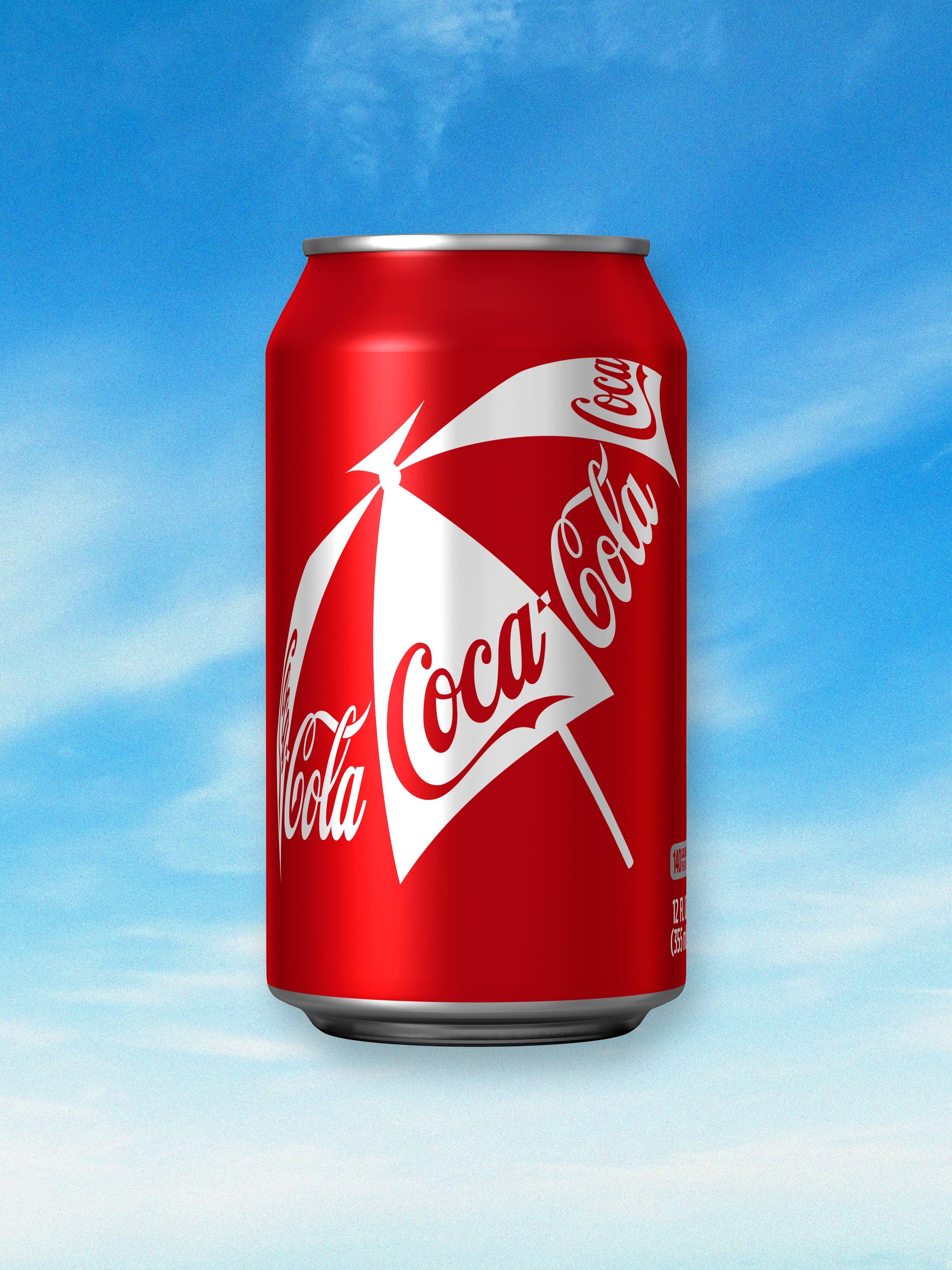
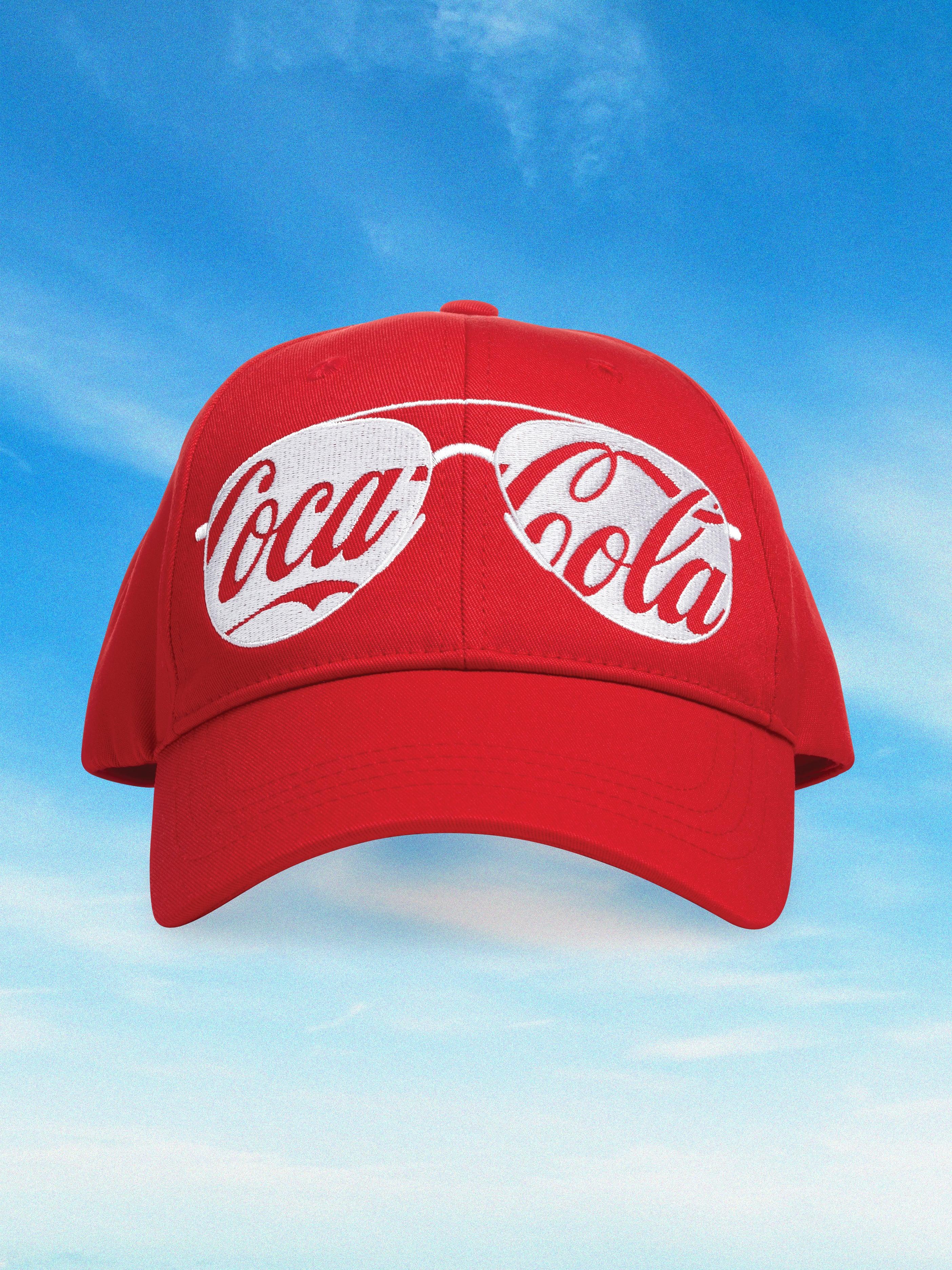
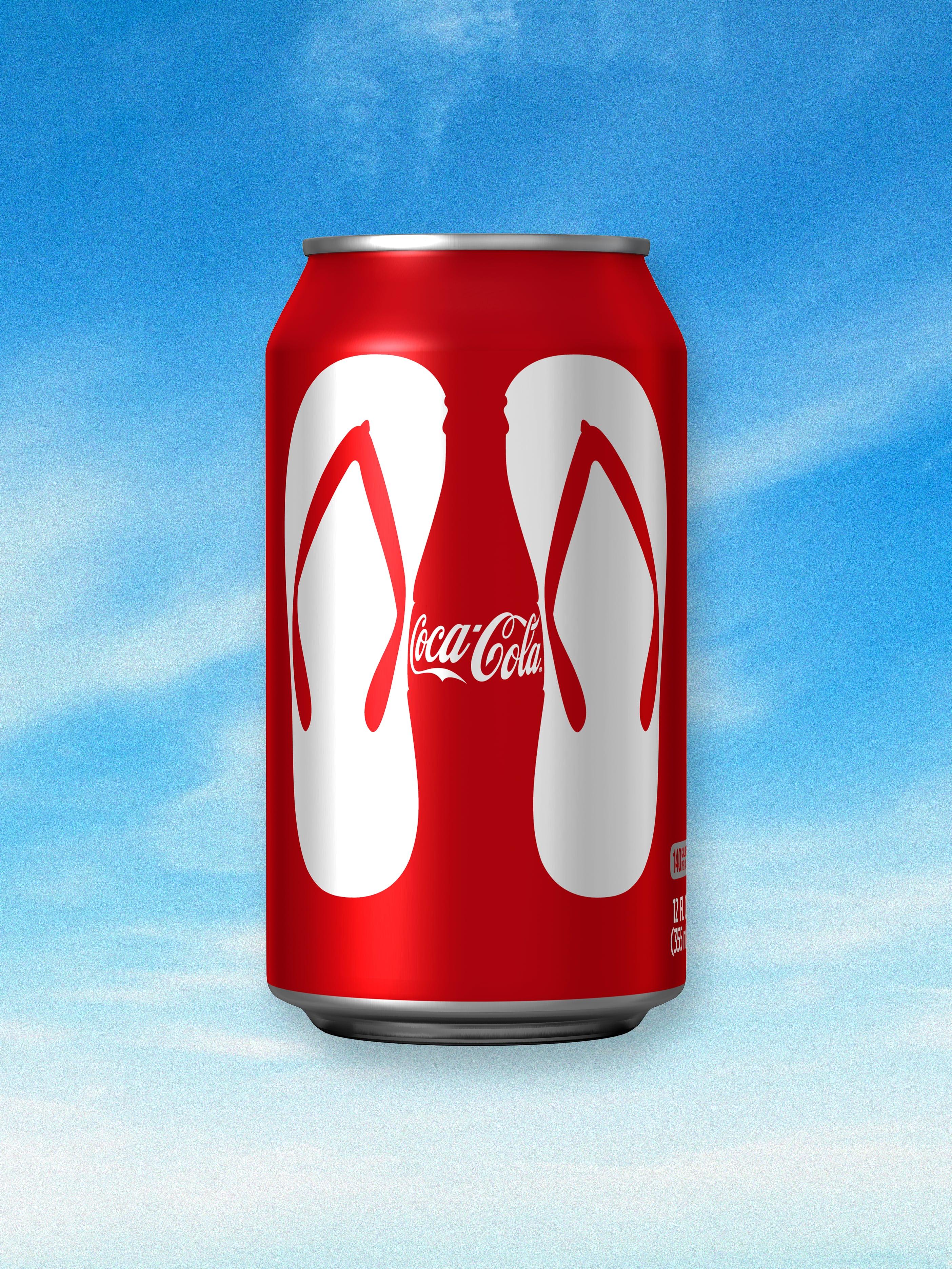
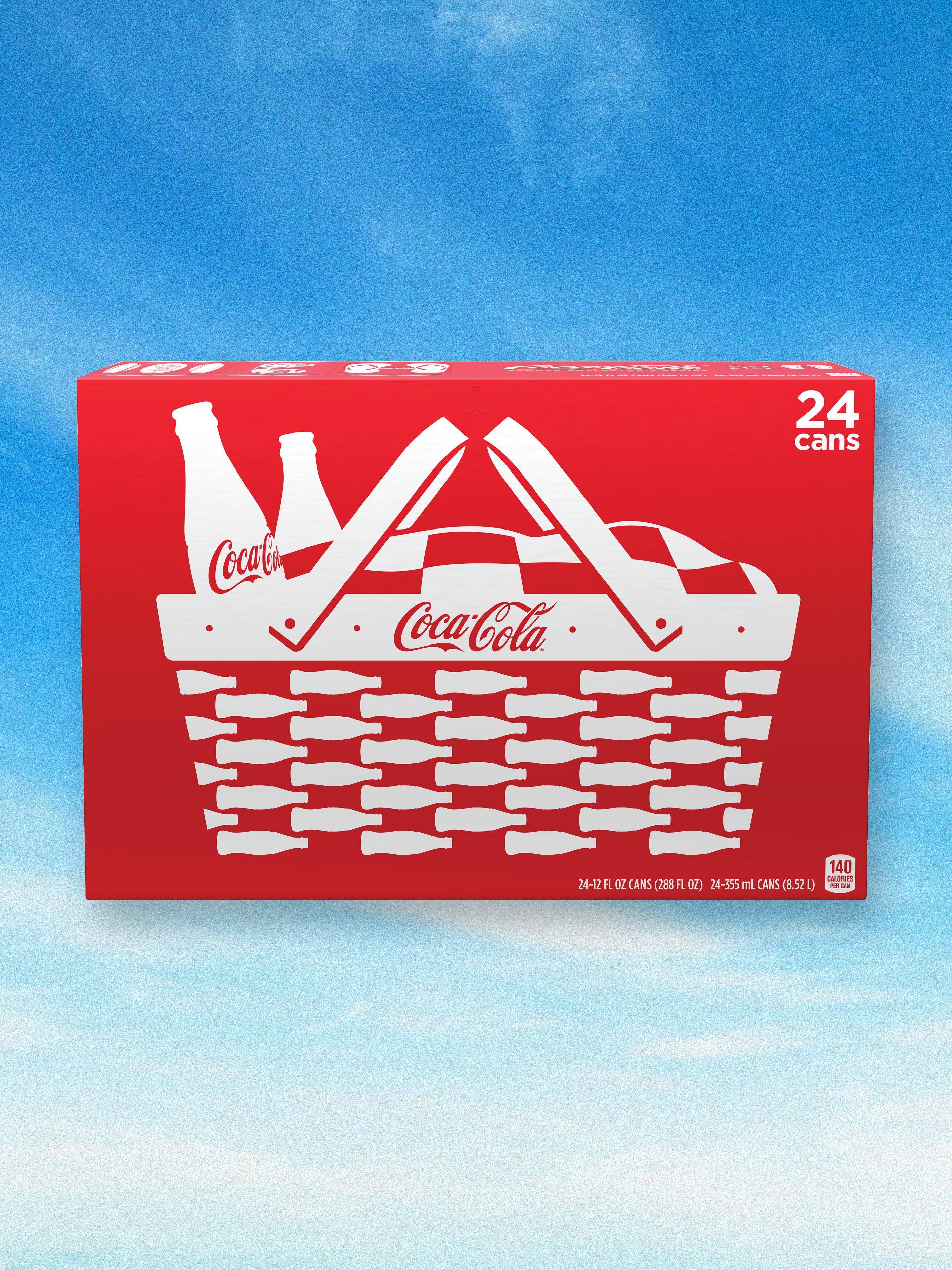
Coca-Cola had some of the most recognisable brand assets in the world. So why not celebrate them? This is the story of how we took a 100-year old classic and energised it for the century to come.
“Do a lot with a little” has always been one of our guiding principles. So we built a clear strategic argument for simplifying Coca-Cola’s visual identity. We decluttered their complex library of brand assets and reduced it down, so it only contained simple, beautiful elements that were unmistakable: the colour, the timeless script, the bottle and the ribbon.
We then liberated these elements from the rules and regulations and started to play, so everything Coca-Cola touched glowed with the joy of the brand. The basic guiding principles of our original system are still going strong today.
— Coca-Cola Bottle Design Brief — 1915“A bottle so distinct that it could be recognized by touch in the dark or when lying broken on the ground.”
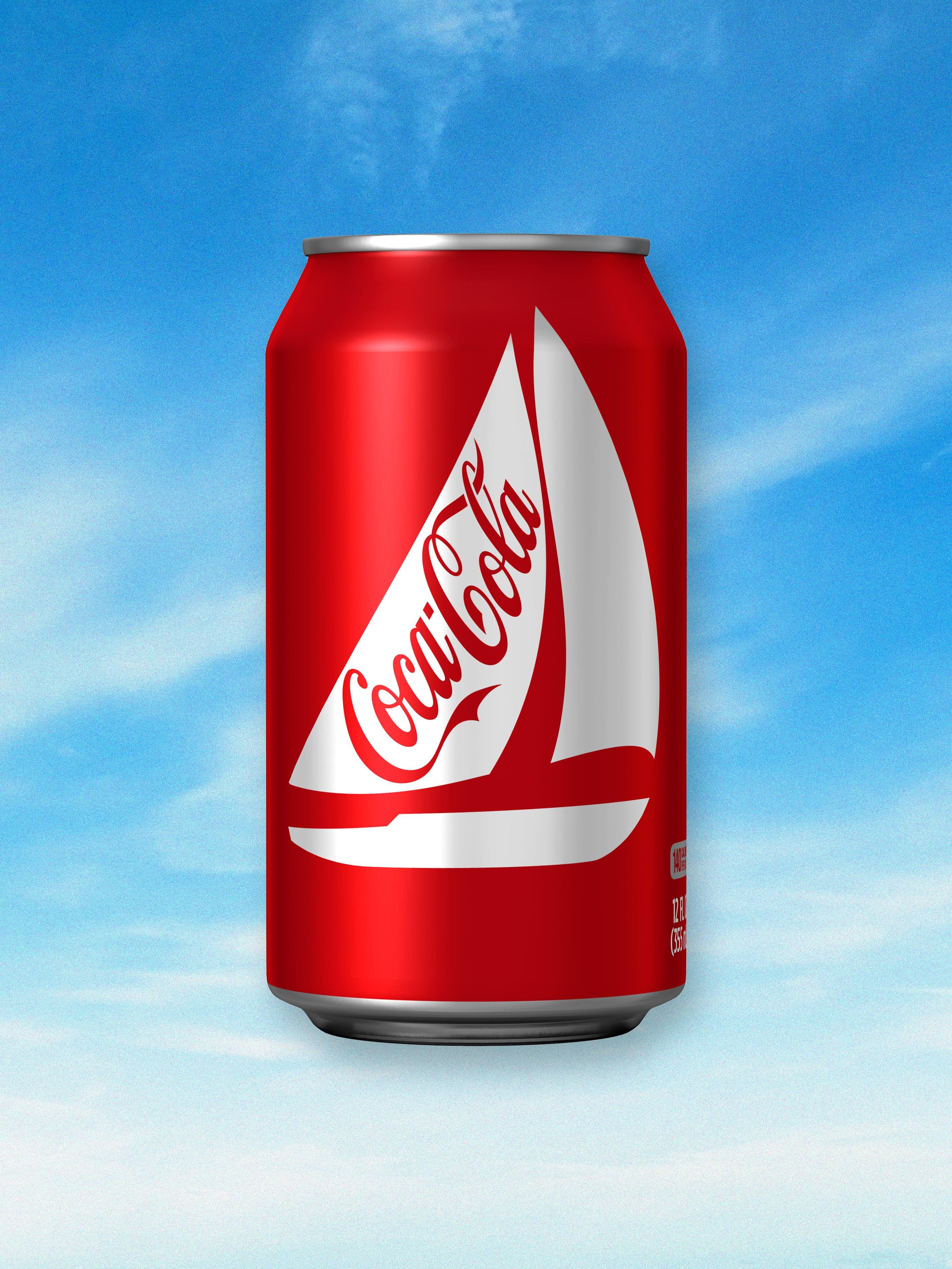
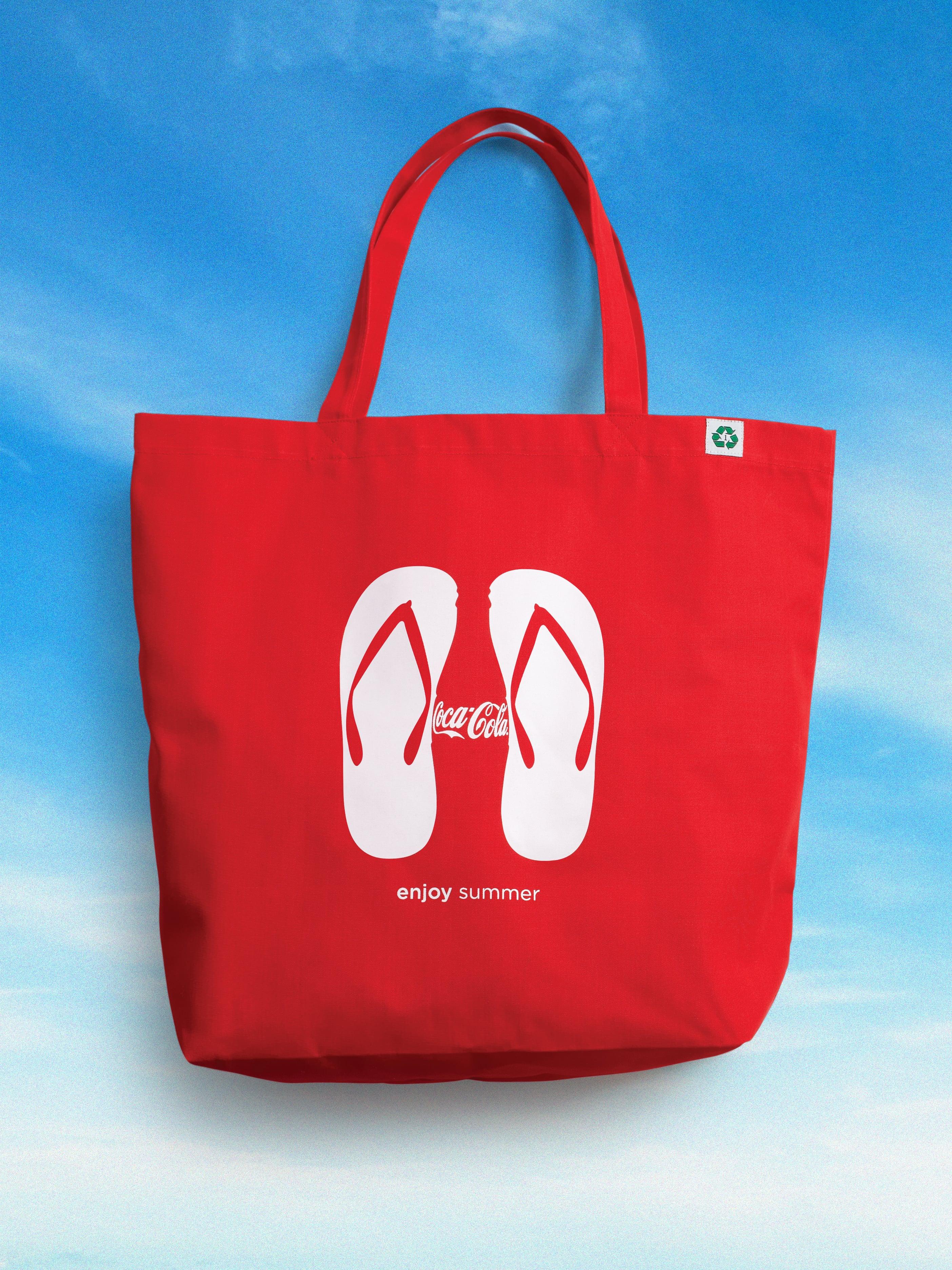
There’s power in simplicity. It gives you enormous freedom. And, over the years, our visual identity system has flexed to encompass a vast range of seasonal and promotional designs. What started as a promotion for Six Flags became a highly covetable program that established Coca-Cola as a refreshing celebration of all things Summer. The stuff of memories, moments and fun in the sun.
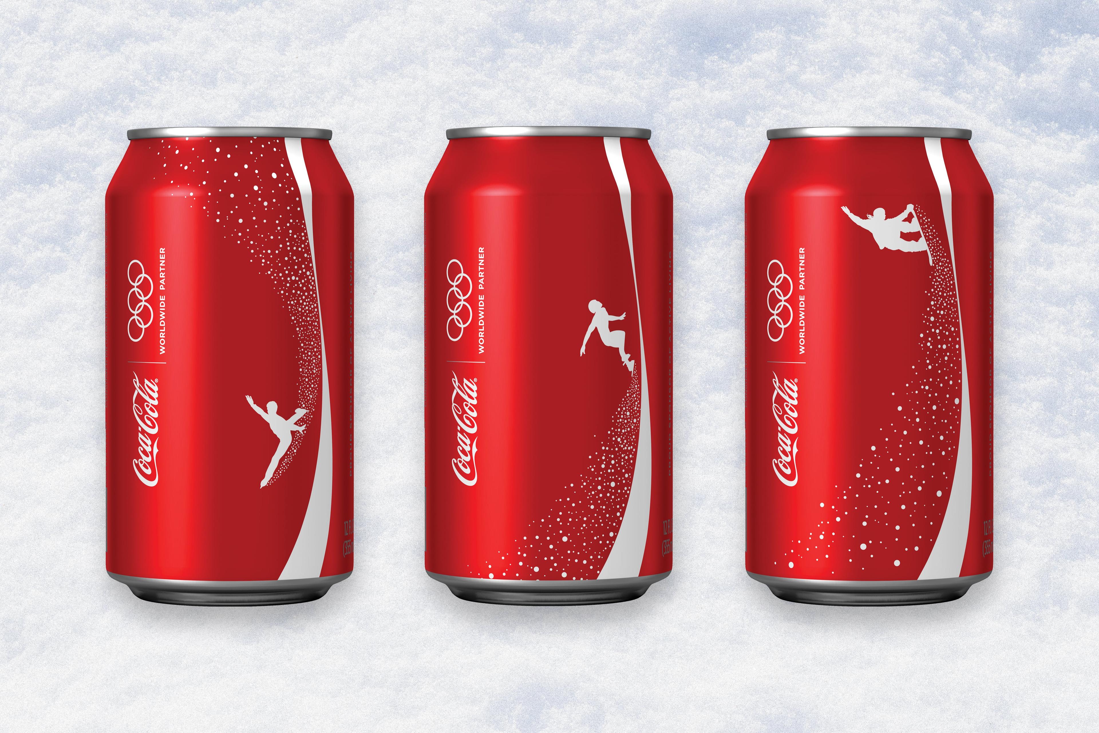
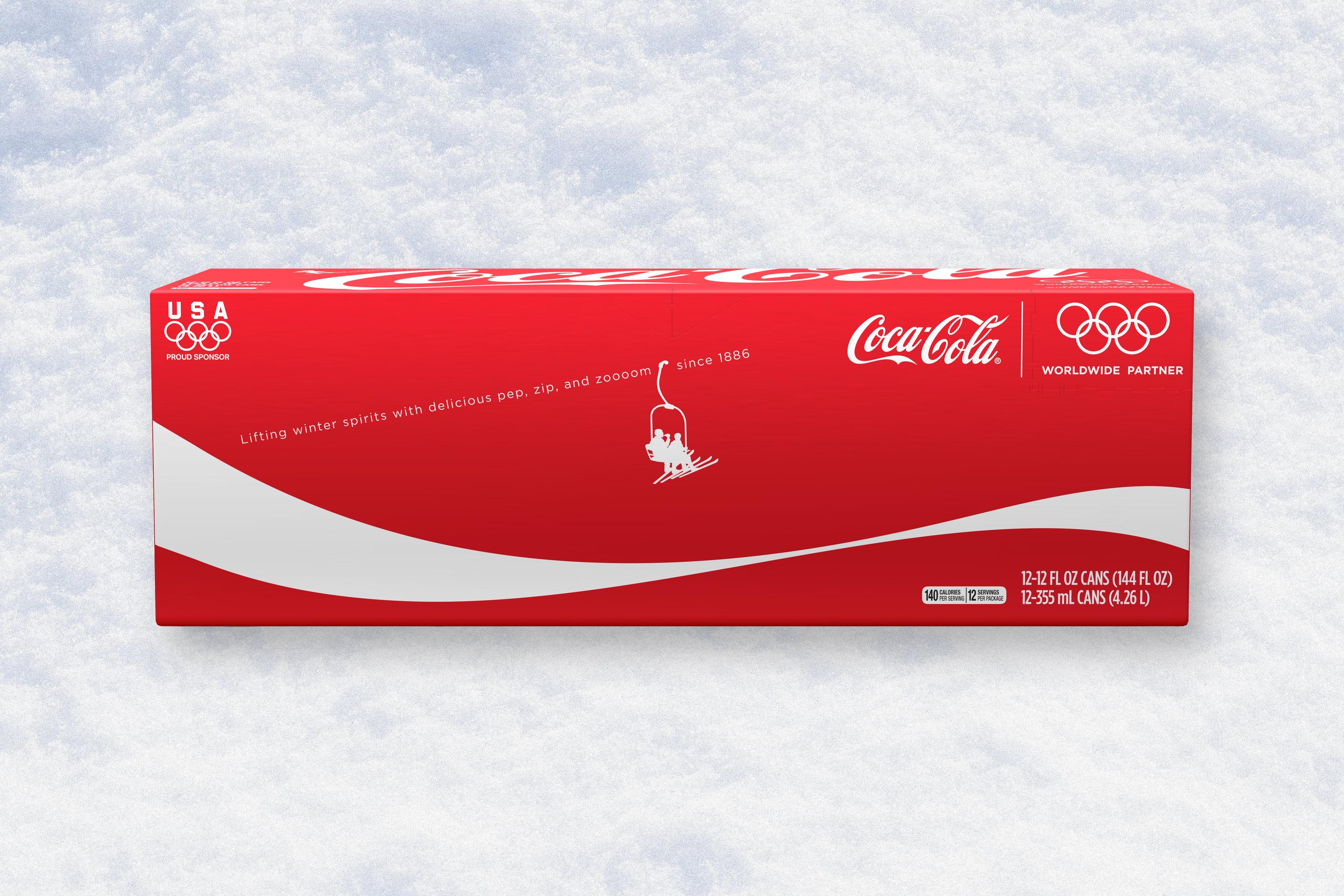
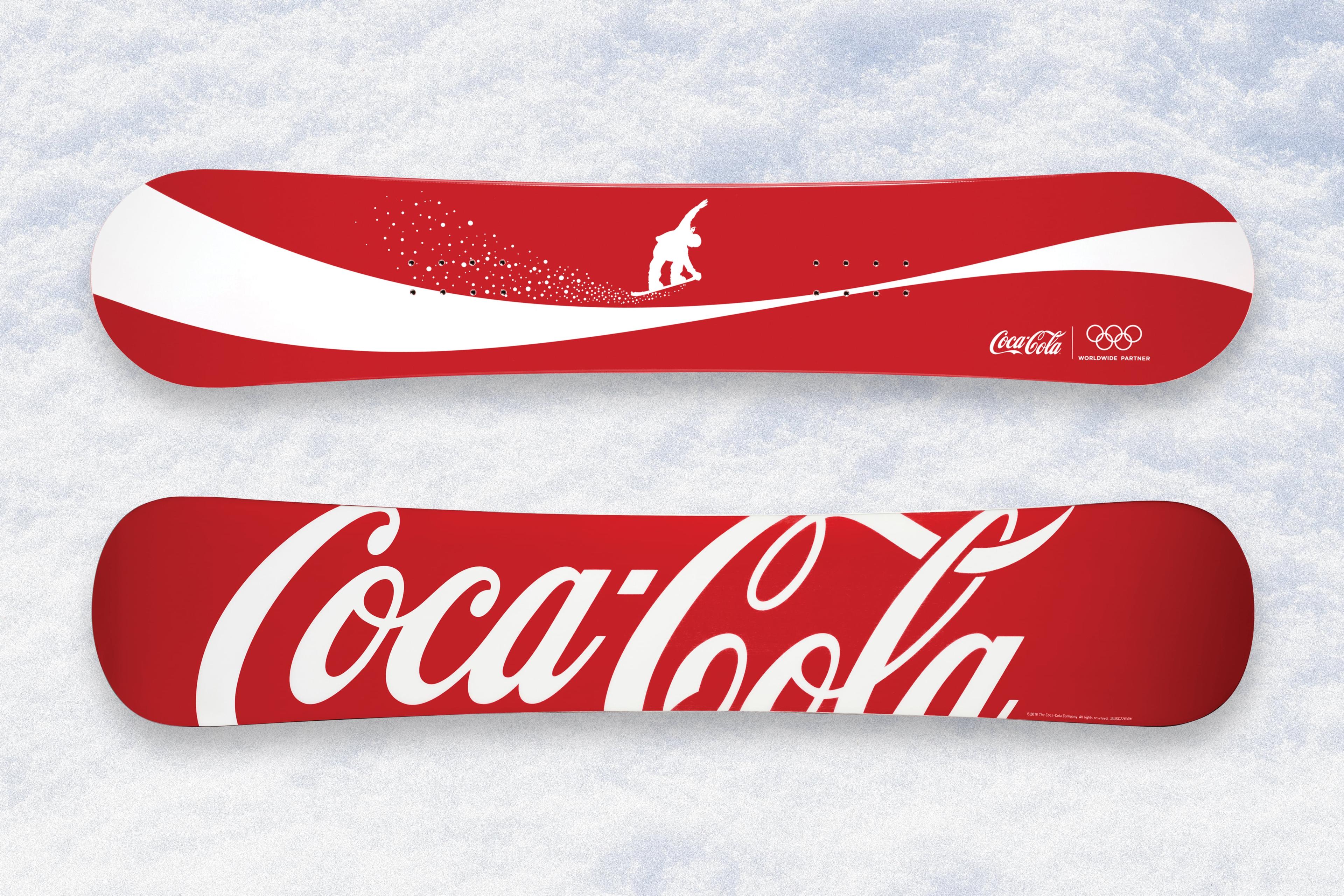
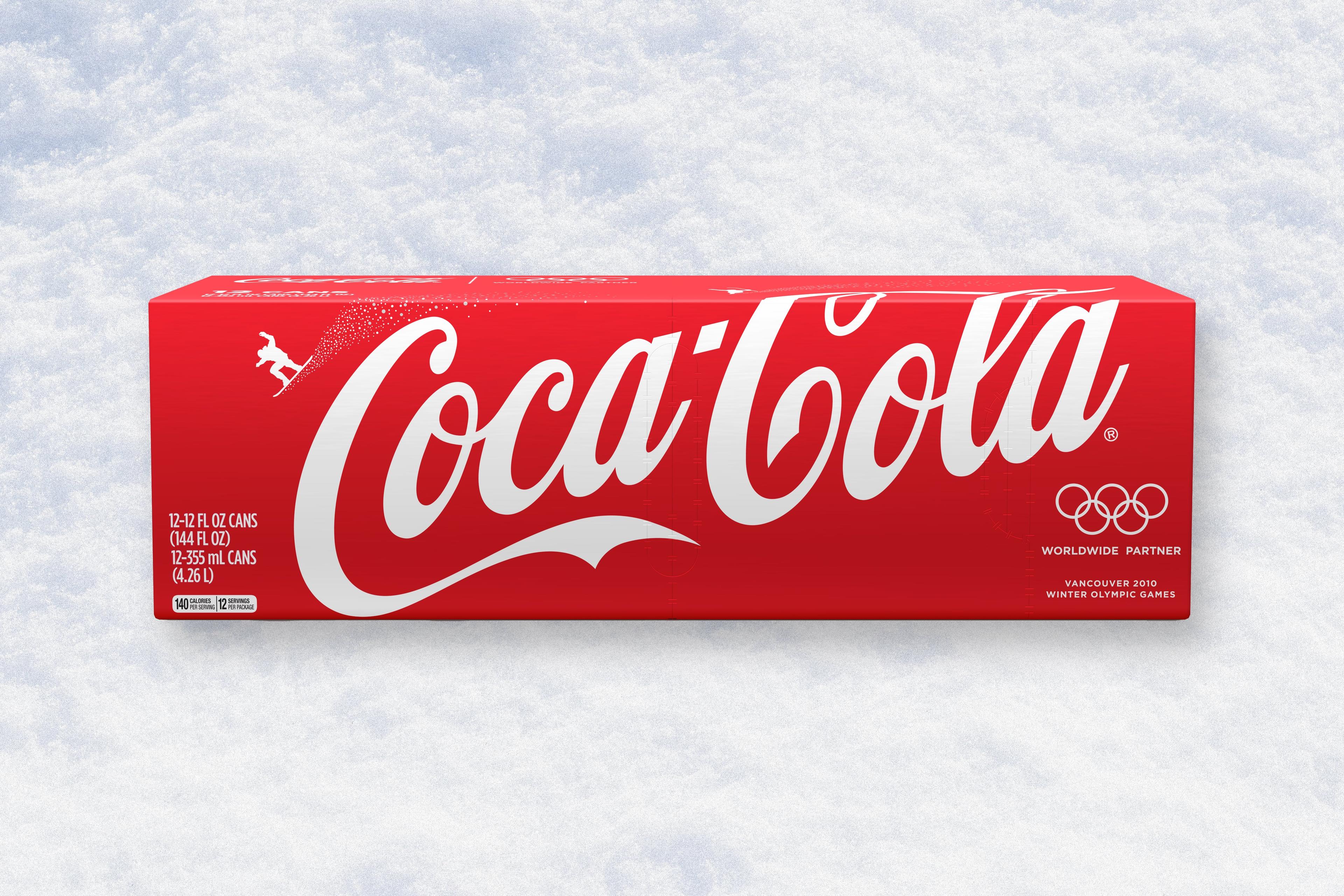
Our playful 2010 Winter Olympic designs are still some of our favourite applications of Coca-Cola’s visual identity system. The Ribbon stepped up to the podium to deliver a wintery landscape for each of the sponsored athletes. Lifting sports fans spirits with the “delicious pep, zip and zoom” of caffeine and energy that kept the brand front and centre, whatever the weather or personal best.
